
100% UX-proof enterprise website
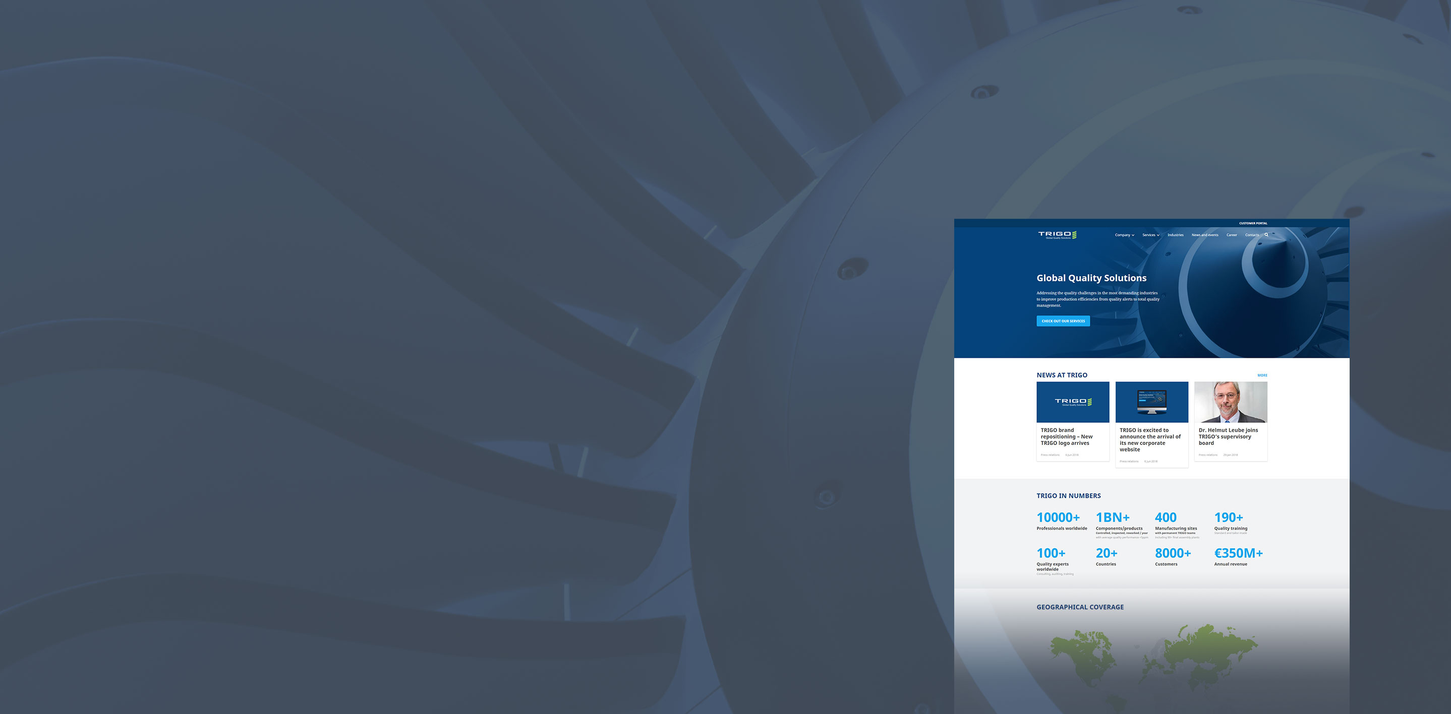
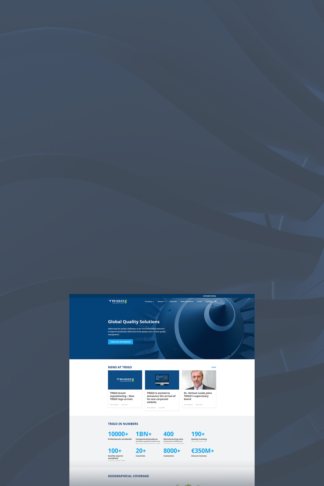
The trigo-group.com has been renewed according to the user’s experiences and needs with a flexible and easy-to-edit admin UI.
Project background
We got proposed to attend the tender of the trigo-group.com site renewal in February 2017. As a cutting-edge solution was required, we looked for a professional UX team to work with to achieve the best result. This way we found a team of capable young enthusiasts.
After several rounds our compenian turned out to be the winner; workshops, business strategies, user persona’s definitions, plenty of UX researches and designs were made until we got to the realization of the project.
About the client
Founded in 1997, TRIGO is a multinational company providing operational Quality Management solutions for the manufacturing sector, especially in the automotive and aerospace industries. With a team of several thousand professionals present in 20+ countries across 4 continents, TRIGO offers a comprehensive portfolio of Quality Assurance services ranging from inspection to expert auditing, consulting and training.
(source: https://www.trigo-group.com/en/company/about)
Training platform
Compared to the legacy system, the most significant new feature on the new website is a custom Training section. The users are able to choose from three different categories depending on their preferences:
- onsite training, the use case will end with a contact form submission
- e-learning option, they will have the opportunity to pay directly with PayPal
- public seminars, they can either pre-register, request for a custom offer or pay directly with PayPal.
Several dependencies are extending the flow according to the user’s actions.
Career page
As the career page is one of the KPIs, it tends to be as simple as possible to satisfy the users’ needs and to grant a smooth journey. The page collects all the open positions within the company for what the users can apply by submitting the online form or can be redirected to an external career portal.
Landing Page Creator
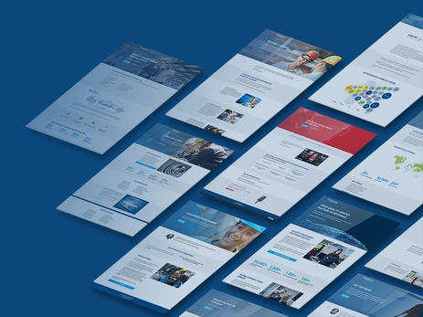
The editors have been created 40+ single-page microsites based on components without involving a designer. These sites are not part of the main navigation and run on their custom URLs on separate subdomains. They are a great way to drive conversions for specific events or marketing activities.
Challenges
UX collaboration
Having user researches to get the most out of a project is indispensable in many ways; we truly believe that the greatest user experience can be reached only by knowing your visitors and your own goals at the same time. Nevertheless, we learned a lot about the importance of the UX and development team’s close collaboration. Finding the most effective working methods, keeping in mind the limits of the systems and tools we use was tricky sometimes, but at the end, worth of every effort.
Training section
The workflow of the training registration process is fully custom coded, since it requires a unique logical structure following the use cases came out upon the user researches. The PayPal integration is a custom module also.
Custom notifications for different actions
In general, the automated e-mail notifications are triggered depending on whether it is a general form or a location-based form, the notification will be sent to a general address, or to the users matching the same location, as the inquirer. This logic applies for the sales contact forms, training contact forms, job proposals and case study download forms too, being fully GDPR compliant in the meantime.
Customizable contact forms
The service portfolio of the site underwent a whole restructuring to get a clear picture of what the company does. Not just the content, but the responsibility over each services got separated what we managed to do with customizable contact forms. By this action every content can have different contact persons with custom address fields, profile photo and mailing address.
IP based identification
On the Contact page the visitors are redirected from the 23 different countries to the one matching their location according to their IP address. If none of them matches the user gets to the main contact page.
Using Paragraphs for the most of the content on the website
One of the key points was to create a system, which is easy to use for the editors. By using the Paragraph module we managed to create a fully customizable system. Currently we use 13 different sections with multiple layouts, color schemes and width setups. All the image fields are cropable in different predefined desktop and responsive styles.
Solutions
Microsoft Dynamics CRM integration
Using the Odata Client module created and supported by BRAINSUM.
Other special contributed in-use modules
Paragraphs for page building, Simple Event Calendar (customized), Breakpoint for image styles, Role Delegation for user management, Address to implement ISO address formats, Entity Reference Revisions, Light Gallery, Crop API for image cropping functionality, Add to Calendar module enabling to add events to Google calendar by a click, Diff module to expand revisioning, Search API
Cookie Consent
Open-source cookie consent solution compliant with GDPR ePR created and maintained by BRAINSUM.
JavaScript
We used the ResponsiveSlides.js for the testimonials’ sliders, the DropzoneJS for file uploading on the Career page, and Lightbox for galleries and videos. Otherwise, we used only custom written JS codes for smaller features, but tended to solve everything with CSS.
Business value
Content teams in different geographic locations are able to update the site for their countries and language. Marketing can launch new microsites easily. E-learning is generating revenue. HR and Sales are receiving data in the Dynamics CRM promptly. All this in a future-proof, sustainable CMS system running since 2018, continuously upgraded to the latest Drupal version.


